Intro
The quest for “the perfect browser” is neverending – mainly because our needs change with time, and what we look for is something as fluid as our online habits. After a long history of switching from one browser to another, from Netscape Navigator (yep, I’m this old) to Google Chrome, Firefox, and Brave, each serving its purpose for a phase, it seems like I’ve settled on a new favorite: the Arc browser.
Disclaimer: I am not affiliated with Arc or The Browser Company. This is not a review. I am just showing my sincere appreciation.
Why Arc?
My latest desktop browser was Brave, which I loved for its performance, integrated ad-blocker, and privacy features. Still, I was looking for something different. For example, I tend to open many tabs, and I have always found it difficult to organize all of them – no matter what extension I tried.
Arc isn’t your typical browser. It promises more than just a simple door to the web. It is like a “web operating system,” offering a new way to experience, organize, and interact with the internet. Here’s how it redefined browsing for me!
1. More browsing real estate
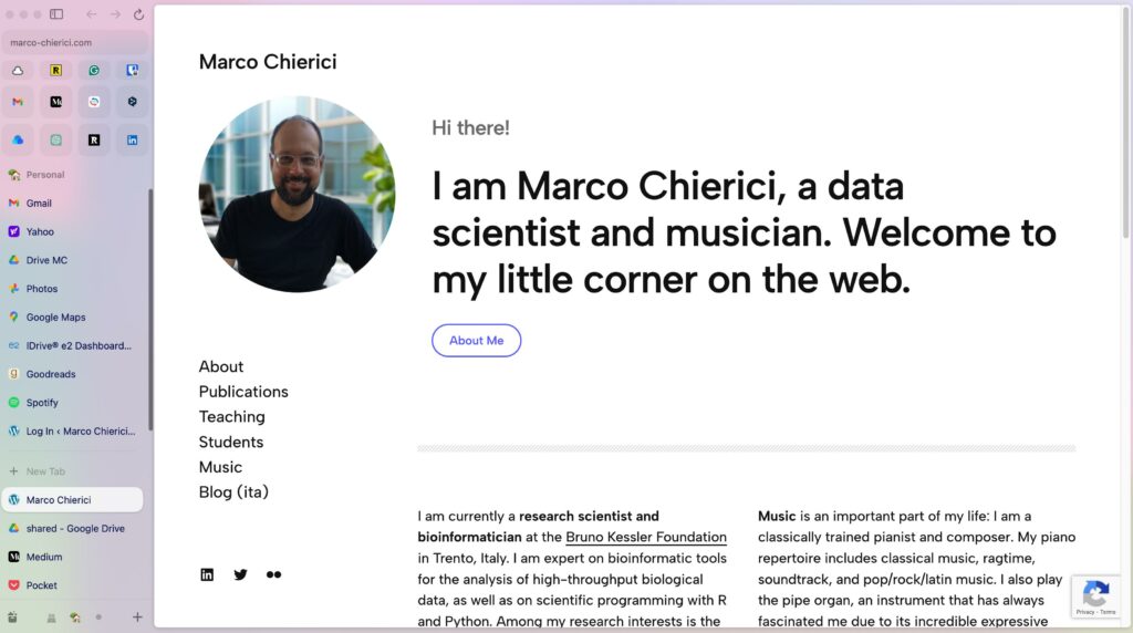
Arc’s design puts content in focus, bringing me a larger, uncluttered browsing window. There’s an unobtrusive left-hand sidebar acting like a sort of control center. In fact, the sidebar shows:
- a minimalist navigation bar with a short URL toolbar
- your pinned extensions (top row in the above screenshot)
- your favorite sites (second and third row)
- your tabs, arranged vertically.
2. Favorite sites
The sidebar is highly customizable. Just below the URL toolbar there’s an area where I can pin my most-visited pages, ensuring they’re always just a click away. They are nicely shown as large square icons.
3. Tabs reinvented
In Arc, you don’t have the usual list of open tabs. Instead, think of the tabs as “bookmarks”, which can be permanent or temporary – you decide.
Permanent tabs, or “pinned tabs”, remain accessible even after you close them – closing means you actually close the page view, but the tab bookmark stays in the sidebar. Same also for the favorite sites.
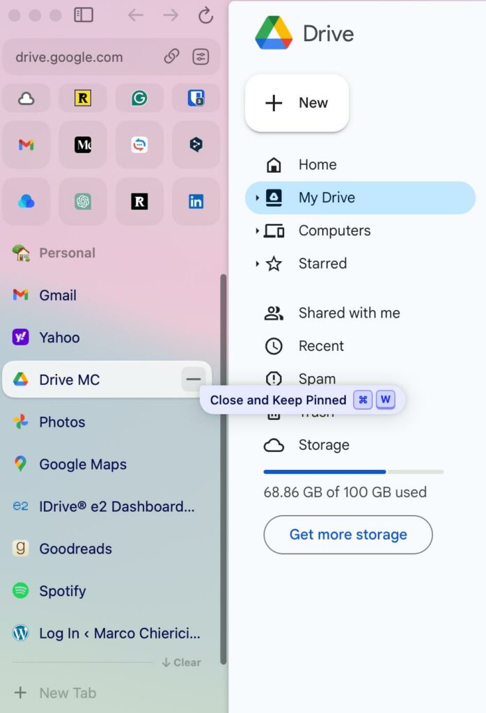
Temporary tabs, or “today tabs”, disappear from the sidebar once you close them: this is similar to what happens in a traditional browser. But there’s more. Today tabs are automatically removed by default every 12 hours (you can increase this time up to 30 days): a great (and a bit bold) way to deal with tab clutter! Worry not, though: the removed tabs go to a searchable archive. If you want to keep any tab, just pin it: pinned tabs are never auto-archived.

You can also create so-called Spaces, each with its own set of tabs (such as Personal and Work), and organize pinned tabs into folders. Favorite sites are shared by all Spaces.
4. Little Arc is great
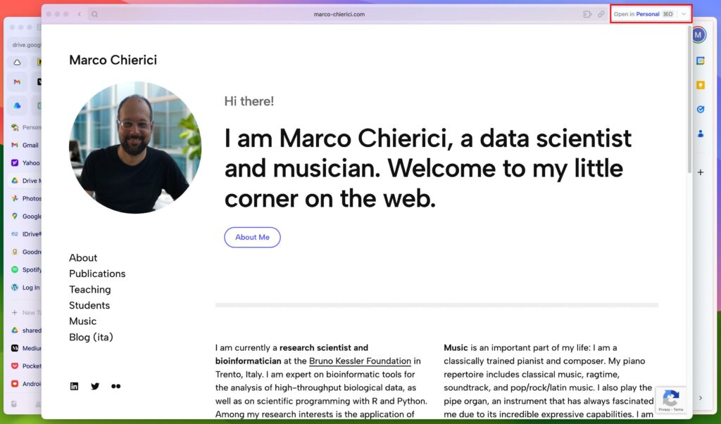
This is one of my favorite features! Little Arc is a clever idea for quick browsing tasks. It is a simplified window holding a single web page only – no tabs, no sidebar. Perfect for single-page viewing or for checking out at a web page. What’s best, in my opinion, is that external apps open links in a new Little Arc window instead of cluttering your workspace with yet another tab. You are welcome!
If you want to do more with the page opened in Little Arc, you can “upgrade” it by opening it in one of your Spaces, where it becomes a today’s tab.
5. Peek: preview sites
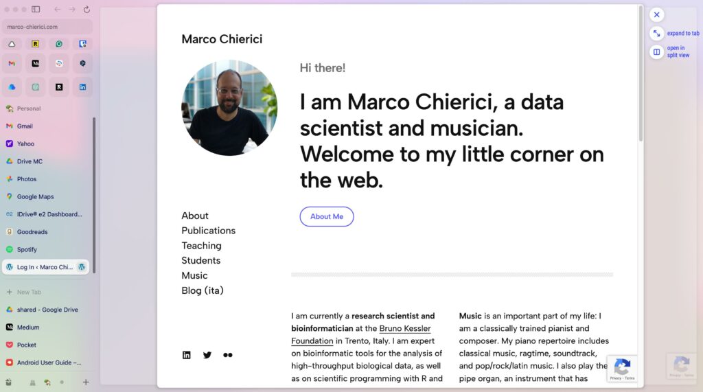
“Peek” is an idea similar to Little Arc. It is a minimalist browsing window (again, with no tabs or sidebar) that opens up by default whenever you click on a new link from a pinned tab or a favorite, so it doesn’t interrupt your workflow. You can then decide to close it or to expand it to a tab in the current Space.
Little Arc vs. Peek
The main difference is that Little Arc is an actual window that you can move and resize, while Peek looks like a modal that overlays over the current tab.
Tips for new users
Getting to know how Arc’s Spaces and tabs work can take a moment. When I started using Arc a few months ago, I was a bit puzzled myself! For me, these were the leading causes of initial frustration:
- “Where’s the current URL bar??” I know, not seeing the tab’s full URL may be startling at the beginning – it was for me. Well, the URL bar is miniaturized at the top of the sidebar and just shows the top domain. Click on it to see the full URL, or type CMD+L. Even better, hit Cmd+Shift+C to copy the current URL conveniently.
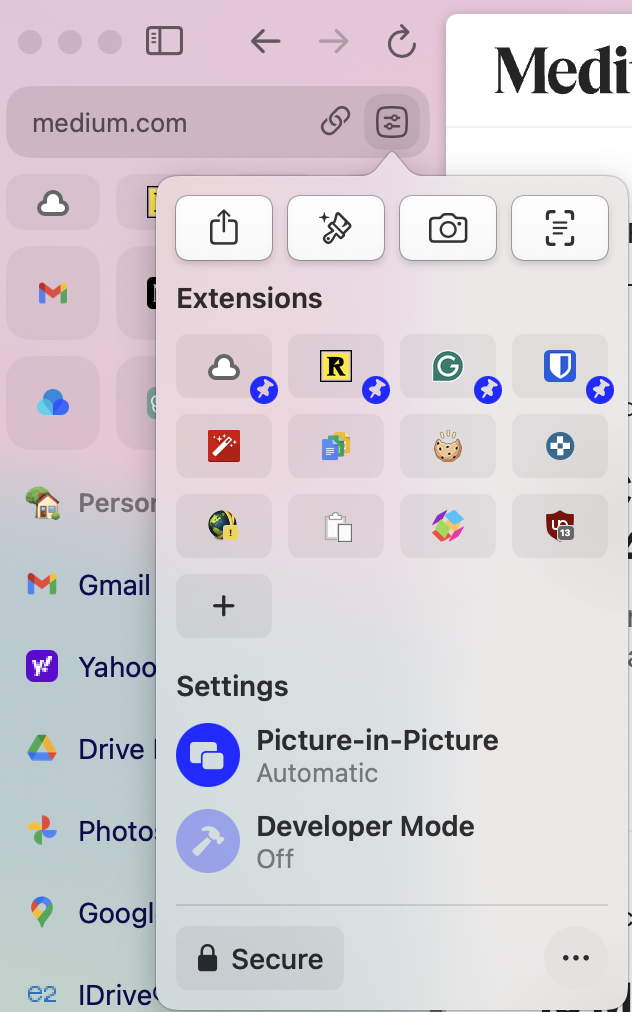
- “Where are the extensions??” Hovering on the shortened URL bar, you can open the Site Control Center. From there, you can manage the extensions and access other useful stuff (e.g. share menu, page capture tool).
- “Where did my tab(s) go??” You need to familiarize with Arc’s tab philosophy: if you close an unpinned tab, it disappears from the sidebar and goes to the archive; if you close an open pinned tab, you keep it pinned, meaning that the tab’s still there and you can reopen it by clicking on it – like an app or a bookmark, if you will. If you close an inactive pinned tab, you will archive it.
Final words
There are other super cool features in Arc, such as desktop/mobile sync, tab split view, but here I just selected those that particularly resonate with me. Find out more here, and be sure to check out the documentation!
Arc is available for Mac and, since very recently, Windows. There is also a mobile app for iOS, called “Arc Search”; its Android counterpart is currently under development.
Leave a Reply